AI based Comparative Customer Feedback Analysis Using Obsei
Table of Content
Reena Bapna
July 14, 2021 • 6 min read
Imagine this: you are a food delivery mobile app company and wants to gather the information on what people feel about you and your competitors and wants to analyze that information for actionable insights.
It has traditionally been a process reserved for skilled data scientists, given that gathering such information requires complex programming skills and an understanding of Natural Language Processing.
Not anymore! It’s so simple that one can get such report in few minutes saving lots of time and energy by using a tool like Obsei (Observe, Analyze and Inform) which is available on opensource platform.
Obsei is an open-source low code AI-powered workflow automation platform. It observes unstructured data from various sources like social media, app-stores and news, then analyzes it using deep learning models and generate structured data in analyst desired format like CSV, Pandas DataFrames, etc.
As a part of my project-based learning, I took up a task to compare & analyze the sentiments of two competitive brands (Swiggy and Zomato) from the feedback available on App stores. I have divided the task in two parts.
First part was to collect and organize the text data by category/features (Price, Ease of Use, Delivery, Offers etc.), then clean the review text, perform sentiment analysis on each text within the category and get the output in panda data frame or CSV to analyze it further.
And the second one was to visualize the data to get the actionable insights.
Part 1: Used Obsei to perform AI based sentiment analysis and collecting the relevant data in CSV file.
Obsei helped me to sort the first and most important part of collecting the data.
Just by putting basic details of app like app id, location and categories on which data needs to be segmented. we can easily scrap the reviews data from Google Play Store and Apple App Store and save it in drive in CSV format as below.
I zeroed on six categories which I feel are important for any food delivery app that are order placement, payment options, real-time order tracking, rewards & discounts, social media integration and user interface for topic classification.
I have collected recent 1400 reviews (700 each) from both Play store and App store.
Workflow
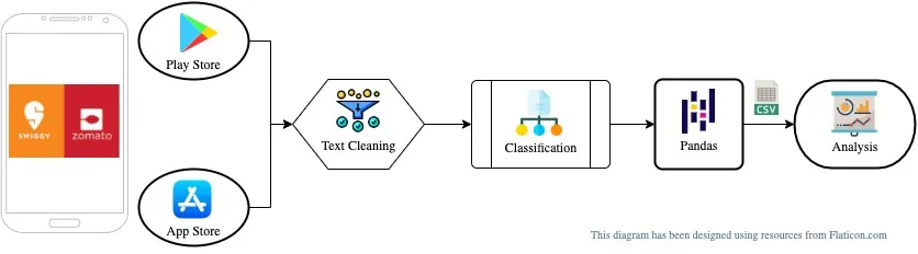
- Observe: App Store’s / Play Store’s app reviews
- Pre-process: Clean review text with properly
- Analyze: Classify review text within given category list
- Inform: Provide all data in Pandas DataFrame
- Store: Store data in Google Drive in CSV format
Google Colab projects links has been shared below from where you can directly get the source code to generate the CSV file.
- Play Store: Colab - PlayStore PreProc Classification Pandas
- App Store: Colab - AppStore PreProc Classification Pandas
Part 2: Data Visualization to get the Insights
Now the second part was to visualize the data and get the actionable insight by doing comparative analysis on the data fetched.
Steps involve in doing the visualization.
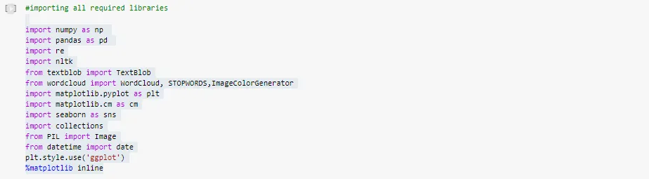
- Import all required libraries like NumPy, pandas, word cloud, matplotlib, seaborn, nltk, collection.
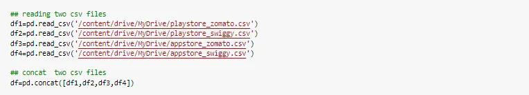
- Read and merge CSV files of data collected from App Store and Play Store.
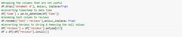
- Text cleaning and pre-processing the data.
- Data Analysis using distribution graphs like bar graphs, pie charts, area graph, box plots, heatmaps, word cloud, word frequency graphs.
Data
Importing all required libraries
Text cleaning and pre-processing the data.
Data analysis
I started the analysis by adding some more features to the dataset. like length of the review, the word count of each review, adding the Polarity and sentiments.
Polarity shows the sentiment of each text. The Polarity value ranges from -1 to 1 where -1 represents the negative sentiment, and 1 represent positive sentiment.
Distributions
I started with the distribution of the wordcount, review Length, and polarity of the data set.
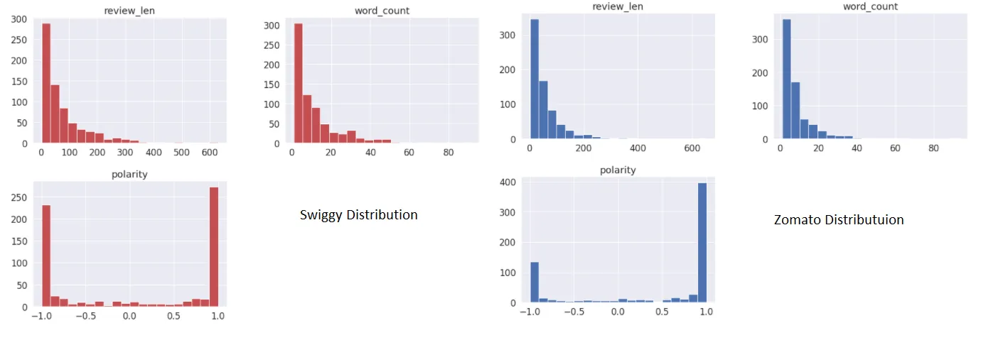
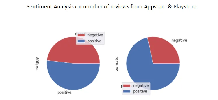
The distribution of review length and the word counts are similar as expected for both the brands. Most l reviews are short in length. Polarity seems to be right-skewed for both brands, but Zomato polarity is highly skewed towards right .That means for Zomato, maximum reviews have a positive sentiment. It was clearer when we visualize the data using pie chart.
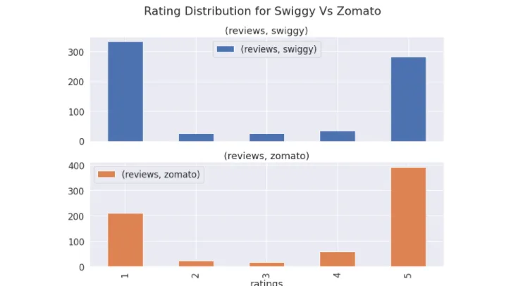
Again, if you see rating distribution of Zomato, number of reviews for 5 rating is more than that of Swiggy’.
Review Length vs Rating
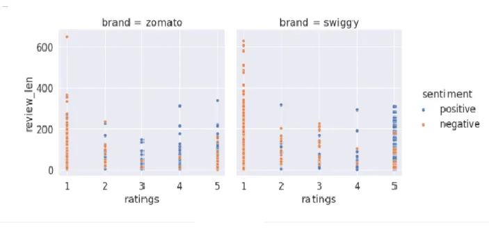
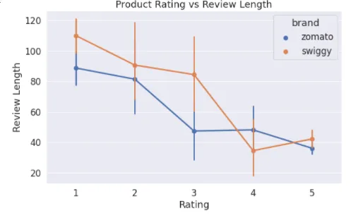
I tried to see if the review length changes with rating and whether sentiments have any relation with the length of reviews.
It was interesting to see that when the rating was 5, review length significantly went down. So, when customers were happy, they did not write too much!
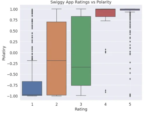
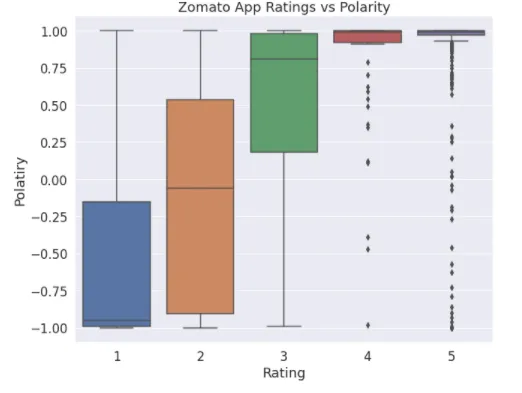
Polarity vs Rating
I wanted to check if the polarity goes with the rating. Mean polarity keeps going up with the higher rating in case of Zomato but the same is not true for Swiggy.
There are a lot of outliers in rating 1 and 5 though.
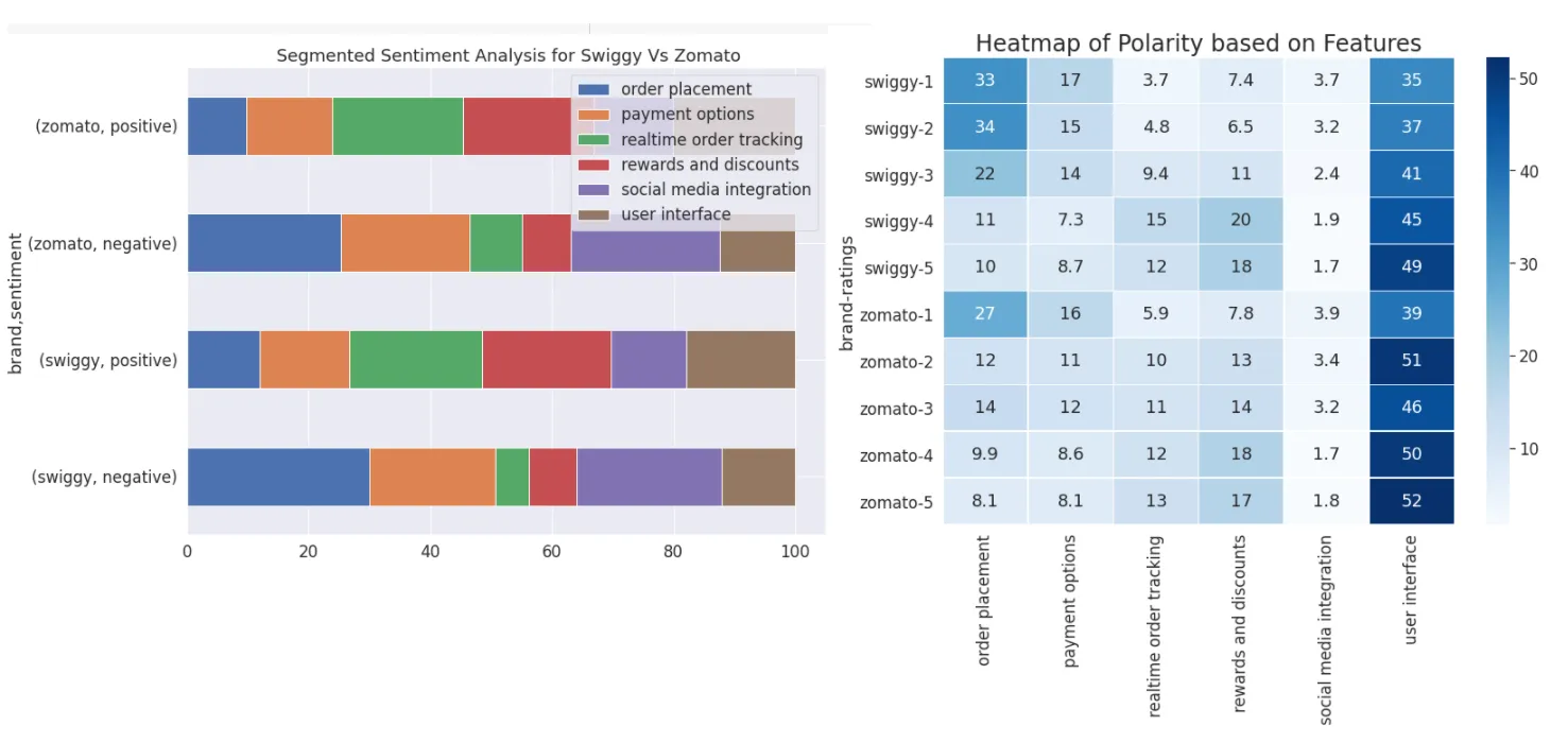
Sentiment Analysis based on Features/Categories
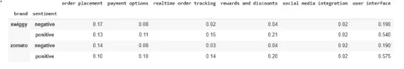
Analyzing sentiments of user conversations can give us an idea about overall brand perceptions. But, to dig deeper, it is important to visualize the category wise data.
Based on dataset, User Interface, ease of order placement and flexible payment options are the most critical factor for any food-based delivery app.
Rewards and discounts and real time order tracking makes consumer happy.
Positive & Negative Wordclouds for Swiggy & Zomato
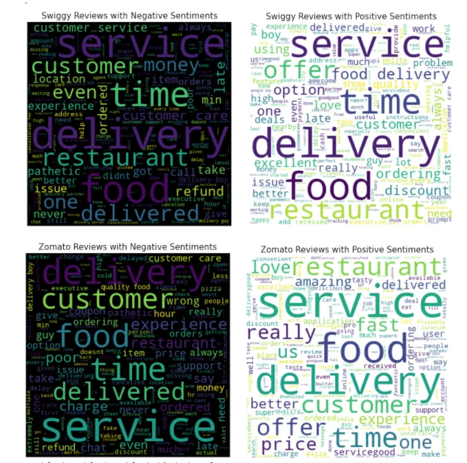
Word cloud is one of the most common and beautiful visualization for text data to plot the frequency of words. The bigger the words that appeared more frequently in the text.
Service, Delivery & Time are the most common words that is used with both Positive & Negative sentiment in food delivery apps.
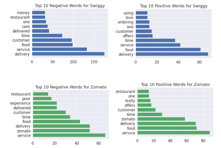
Frequency charts to show Top 10 Negative & Top 10 Positive words
I tried to present some great ways to understand or extract information You may choose whatever feels suitable for you.
Hope you will try all this on your own dataset and do some cool analysis.
My sincere thanks to Lalit Pagaria for building Obsei, a wonderful analytical tool, that helped me to ideate and formulate this analysis.
Many thanks as well to Sanjay Bharkatiya who provided extensive insight and support throughout the editorial process.
Feel free to follow me on Reena bapna - LinkedIn
References
- Playstore: PlayStore PreProc Classification Pandas
- Appstore: AppStore PreProc Classification Pandas
- Obsei Repo: https://github.com/obsei/obsei